DSDN 101

DSDN 112

DSDN 141

DSDN 142

DSDN 144

DSDN 171

Thursday, 18 October 2012

DSDN 142

Project 3

Mouse Toy
Development

After a long period of experiments and hair pulling stress of countless and countless code that just wouldn't work, I managed to successfully develop this idea into what almost looks like a final. Originally I was thinking of having a reset button, but I thought what would be the fun in that? Just press a button and boom, starts all over again back to square one. Instead of that however, I set up the squares so that after a certain amount of bounces they would just fall from the bottom of the screen and disappear forever, with the exception of the very first square to stay of course. My friend who does coding up at Kelburn campus talked me through it and taught me how to add counts within my code so that the random generated squares would disappear after their time is up. I have uploaded a video below which showcases the process and interaction so far, I have also added music to it just as background noise since it was recorded straight from my laptop.


Song used - "Sierra Leone" by Mt Eden Dubstep

DSDN 142

Project 3

Mouse Toy
Development

My idea is to develop my recent sketch so that it starts off with a black box with a singular square bouncing up and down. This square will be flashing with rainbow colours which look great and contrasted with the black background. Taking the idea from tetris and the original code from the tutorial, I want to spawn more squares randomly with an interaction. I started off by using the mousePressed function to click on the bouncing square so it can generate more squares, but that was far to hard as the object was too quick to be clicked on and processed. So I changed this to mouseMoved which simply means I just have to move the mouse cursor through the shape to create more shapes inside the box. 

The images below were my earlier experiments using just plain black and white colours to show how this exactly works. As you can see it starts off with only one, then as the cursor moves through it the more squares spawn and so on. In the end you're left with a very noisy box filled with white squares with no where to go. It didn't get laggy for a while however, but after a few seconds it started to slow itself down. I figured a way to fix this would be to either add a reset button, or find another solution.


DSDN 142

Project 3

Mouse Toy
Development/Research

I researched around to what looks similar to my idea to gain inspiration from, and found that the game tetris could be a good influence within my interaction. I thought this because of the wide range of randomized colours and the fact that is uses squares/rectangles as the shapes within it. Of course mine isn't going to be a game nor will it move like the way tetris moves, but it'll have some of it's qualities expressed from it.

Image retrieved from: https://blogger.googleusercontent.com/img/b/R29vZ2xl/AVvXsEiRKMAKdjR8kNOfa4sgFihEKmgtfGyKUmo4CPNLfKvs6hoL6kkwLAHOuT7PtgoxlsGCpt39Tr6VygfYkRDrJKKNINNepHTgUiNxEnzxAdiTyWbtlRWXqXBh5N6jZy5Tw3vwyxfXVBvWNH8/s1600/fullscreen_tetris.png

Image retrieved from: http://i1003.photobucket.com/albums/af157/hostic/tetris.jpg

DSDN 142

Project 3

Mouse Toy
Development

Leading on from the last post, I decided that the plain grayscale colours weren't going to work, since they didn't stand out that well at all. With this one, I added R, G, B to it and randomised the colours so that the square would flicker through every colour as it moves. This is what it looks like and I quite like the look of it - 


DSDN 142

Project 3

Mouse Toy
Development

This is my idea, well the start of my final idea. I experimented with different colours and once again couldn't decide what to stick to, so I just chose white, grey and black for a start to see what it would look like if it were to change and flicker through all of them. This is what happened -


DSDN 142

Project 3

Mouse Toy
Development

Continuing from last post, I have experimented with the number of objects/shapes that are inside the box. I tried it out with just the normal 20, then 40, then 100 shapes bouncing up and down. I also chose to change it to a rectangle because the animation is much more clearer compared to an ellipse when it bounces, plus it looks a whole lot better. In the end, I found that i liked and enjoyed the look of all 3 sketches.


DSDN 142

Project 3

Mouse Toy
Development

I've been experimenting a lot with my code and what it does, and have decided to tweak it a little and develop it to something that would be more interactive and cool to look at. Instead of having floating bubbles, I had a look around and found that the tutorial -

"particleengine with sound"

on the

http://schoolofdesign.ac.nz/course/view.php?id=128 website

was something I found I could look at. I didn't focus on the adding sound part but I liked the way that the objects bounced up and down. I've taken a screenshot of what the code they have provided looks like, with a couple of experiments of my own below. The normal code consist of just 20 ellipse's bouncing up and down. I changed up the shape to rectangles and also inverted the colour to see which one suited more.


Thursday, 4 October 2012

DSDN 112: Project 2

Navigation Interface

Final

I have created a quick video of my app being interacted by myself, to showcase it's features. This was quickly done on youtube, with the song "Navigator" by Eric Bellinger Ft. Mario & J Doe, which I thought fit in quite well. Enjoy!

DSDN 112

Navigation Interface

Explanation


The navigation interface that I have designed is built for any student needing help to get around the Kelburn campus. It is made for the present day, and is available on all android/smart/iPhones out in the market. It is a user-friendly downloadable app and requires the internet to be used. The grayscale effect within the app also makes navigating a whole lot easier, and puts a whole other perspective on how we view things to this day. The menu is set up to have self-explanatory icons which are easily recognizable throughout the whole application. With the current location marker on the map, users will find it a more efficient way of traveling. The map itself has features where you’re able to search a location which gets marked down showing the exact path to walk in. It allows the user to also enter street view whenever they desire, so that they know which way they should be walking. This app has now also added a social side to it, giving the user the ability to log into Facebook and see what their friends are up to. By adding Facebook to the equation, it promotes the app more for every student out there.

DSDN 112: Project 2

Navigation Interface

5 Screenshot Images

As part of the final hand-in, we are to pick 5 screenshots of the key steps within our interface. I chose:

1. The Sign In page, because it introduces the style to the user straight away, giving them the vision of what this app could possibly do and how it works. It is also very appealing being it is grayscale with a highlight of red.

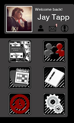
2. The second part is the menu, of course. This stage is the most important because it will define how easy it will be for the user to navigate around the app. With self explanatory and easily recognisable icons, you can't go wrong.

3. The third part is the actual map of the campus. This step will help the user find their current location, add destinations, access street view, and search for a location. The avatar also moves wherever the user travels to make things a whole lot easier.

4. The search tab is the next one. By entering in any place around the Kelburn campus, the search menu will select relevant information and locations that fit the search, and will then carry on to mark the destination to your map.

5. Street view is the last important step within this app. It is because it lets students see what the inside of the building looks like, without having to even go there. With directional arrows to select ways to go, how could anyone get lost?


DSDN 112: Project 2

Navigation Interface
Contact Sheets

These are all the pages and slides that I have put through for my final. If you are wondering why some of them look similar to each other it is because I have put time and effort to making the details. Like each letter being typed in the username and password box, or when searching for a destination. There are also ones where the button has to be pushed twice to make it glow then switch screens. But when I have put it all together in flash it looks good.


DSDN 112: Project 2

Navigation Interface

Research

These were some of the photos I took at the Kelburn campus so that I can use them for my final presentation. I got some good shots, both outside the buildings and a couple inside the library.


DSDN 112: Project 2

Navigation Interface

Interim Presentation

Aside the normal presentation requirements, I went an extra mile to screenshot every slide and put it directly on my iPhone, just to show what it would look like in real life. When looking at it on the phone compared to the print-outs, it actually looks like the app is real and useable. Thumbs up with that!


DSDN 112: Project 2

Navigation Interface

Interim Presentation


For my interim presentation I combined 2 of my concept ideas, the iPhone app that showed the actual map and your exact locations and the other iPhone app that shows the street view. This idea is similar to  google maps but I've integrated it to suit the needs of a student in uni. So the first stage is the login screen, this pops up when you open up the app. This brings you to the sign-in screen where you can either use your custom username for the actual app, or to login with Facebook. I showed myself logging in to Facebook, entering my email and password. After logging in, we are brought to the main menu, with the list of contents there and my name with my Facebook profile pic showing. So the user then selects the 'Navigation' button and away we go. With the screenshots I have taken it is pretty self explanatory on how to use the app, as the instructions are on screen. It allows you to see your exact location, and then type a location for your desired destination. After the destination is selected, it will then appear on screen, with a red line from point A to point B showing the path to get there. Being it is an overhead map, it is pretty self explanatory as well on which way to walk, since your red avatar follows you everywhere. Once you get to your destination, you can then switch it on to "street view" and look at how the place looks like from inside straight from your phone. When in street view it also shows arrows going in directions where you can select and the map will follow. There are also other features I would like to add in my app like messaging within friends, and changing the theme colour. I will look at doing this for my final design.