DSDN 101

DSDN 112

DSDN 141

DSDN 142

DSDN 144

DSDN 171

Thursday, 31 May 2012

Blog 5

Locovisual


Building Researched:
Bank of New Zealand (Te Aro Branch Building)
192-194 Cuba Street


"Bank of New Zealand" photo taken by Jay Tapp


I decided to research the old Bank of New Zealand building, since I have done a bit of research on it before. This building sparked my interest because it is a good example of an old heritage building in New Zealand that in my opinion has been ruined by modern architecture. As we can see in this photo I took, it shows the whole building from side on with the new interior inside which is now Burger King. At the top of the building there's also a new apartment building thats been built directly on top of this fine piece of architecture. The Te Aro Branch of the Bank of New Zealand was constructed in 1912-1913 and was designed by William Turnbull. This building is a great example of the ancient Edwardian Baroque style, adapting the needs of commercial buildings back during that time. "Its solidity evokes dignity, stability, security - and these imposing splendid facades have a great concern for concentrating ornament to give a convincing impression of power and wealth." - NZHPT BCC Report, p2. As such, this building symbolized the greatest prosperity of British imperial and commercial power. 
By introducing an entirely new storey on top of this heritage building, in my opinion ruins the value and history of it. The new apartment building that's been built on top of it, is completely different compared to the rest of it, being designed with a modern architecture style. William Turnbull would not be impressed if he'd seen this. But that's only the exterior, the interior has also been transformed drastically, with it being Burger King. The lighting has been changed as well along with the value of the building in the present day. 


Main resources:


Garnett, O. (2002). Living in Style: A Guide to Historic Decoration and Ornament.
            London, National Trust Enterprises Ltd.


Gatley, J. (1996). Bank of New Zealand Te Aro Branch.
           Wellington, New Zealand.

Other resources:


Heritage Building Search. (n.d.). Retrieved from.
           http://www.wellington.govt.nz/services/heritage/details.php?id=238&m=building&p=0


Bank Of New Zealand (Te Aro Branch Building). (n.d.). Retrieved from.
           http://www.historic.org.nz/TheRegister/RegisterSearch/RegisterResults.aspx?RID=1338

Tuesday, 29 May 2012

Group Work


Advertisement


Conflict Records clashes the formal elegance of classical music and the distorted chaos of dubstep to create a new genre of music aimed at 17 to 28 year olds. Through our advertisement we are showing a literal conflict of the ornament smashing against the graffitied wall to establish contrast between the two diverse music genres we combine. The music we have chosen is “River flows in you Dubstep Remix” by “Yiruma” because it best represents the essence of music Conflict Records would produce. Instead of representing our slogan “Hold onto your snapback”in a strict literal form, we have referenced it in a more abstract way, this allows our advertisement to subconsciously bridge the gap between our two advertising medias. 
Group: Ryan, Hannah, Natalie, Jay


Monday, 28 May 2012

Light

Final Images
Contrasted Wellington


The main keywords I pursued were contrast, focus, lighting, abstract and emotion. In all honesty I wasn’t sure on how my project was going to turn out, since I was doing it all in black and white. But the end result looked amazing and I am happy with my final images. I shot all my photos in colour at first then desaturated them later in photoshop. I had to change my camera settings throughout my shoots as well to give off different amount of light in each image, playing around with the ISO and shutter helped with this. 

Light

Third and Fourth Shoot


Light

Proposal Update


By discovering Paul Politis, I completely changed the style that my project will be shot. Paul specializes in black and white photography that would work well at night. This then gave me the idea of a contrasted style series of photos, where all my photos were black and white and were taken at night. I wanted to portray the areas of Wellington where during the night, the light source would give off an emotional kind of feeling to it, showing this through light and such things as patterns, shapes and shadows. Most of my images I plan to be still life but I am contemplating including light trails in a couple photos as well, just to show the street side of Wellington and how the light from the street is contrasted from the background, which I'm hoping is just plain black. My main idea was that at night, the walk from the centre of town to the waterfront is always an interesting journey itself. I realized how the light source was very minimal in some parts but yet shined onto a certain part of the area/objects. For example a lone street light in the middle of a car park just shining down on one spot. 


Precedents and Research


Paul Politis
http://www.paulpolitis.com/bwgallery/night/photograph.asp?photo=207
http://www.paulpolitis.com/bwgallery/night/photograph.asp?photo=223

http://www.paulpolitis.com/bwgallery/urban/photograph.asp?photo=79

Other Photos (Precedents unknown)
http://www.interestings.net/?p=1619

http://www.flickr.com/photos/popeyee/6697939817/

Light

Second Shoot
Contact Sheets


Wednesday, 23 May 2012

Tuesday, 22 May 2012

Light

Weekly Exercise 2
HDR (High Dynamic Range)

I had a look at examples of HDR photography on the internet and decided I'd give a night time photo a go. It was my first time to ever do an HDR photo so i ran into some difficulties along the way. But I'm happy with my end result. With my photo I managed to catch the flight path of a plane, and if you look closely (I swear) i caught a shooting star in the background, since planes don't follow that path. The first photo is just my chosen photos automated together on photoshop by using the HDR Pro merge. I had 6 photos which were all different exposures so it turned out okay, but had a lot of noise and "ghost". I also uploaded an HDR photo that had the ghost removed from it.

HDR

 HDR (ghost removed)

HDR Effect

Development and Contact Sheet


Wednesday, 16 May 2012

The Clip

Research Inspirations


This one is my favorite drawing stop motion. I like it because it has a long time lapse and throughout each photo that's taken there's no sign of the artist at all. Which means they would have to draw then take a photo of their drawing and so on. This is a clever technique that I could incorporate into my stop motion if I choose to do a drawing animation.

http://www.youtube.com/watch?v=sqdQzuwcobk

The Clip

Research Inspirations


This one sparked my interest as well, because unlike the first video I liked I don't actually have an iPad at the moment. This video is very clever as this person only uses A4 pieces of paper to create the functions of an iPad, without even needing one. I got the sense of the iPad throughout the whole animation so I thought it was very successful. 

http://www.youtube.com/watch?v=-uBi9-iYUi4

The Clip

Research Inspirations


I like this stop motion because it incorporates modern technology and in this case they use an iPad and iPhones to create this animation. This would be a cool idea to use and just have several pictures/jpegs saved and then just flick through each image to create my own stop motion.

http://www.youtube.com/watch?v=ESkN5pZKiyk

The Clip

Individual Brainstorm


Tuesday, 15 May 2012

The Clip

Group Brainstorm


Bianca Taylor, Emily Wakeling, Nick Wellwood, Jay Tapp


Timeline on the Animation Evolution


Light

First Shoot


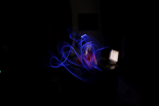
My first shoot was just a quick and rough shoot to get the idea of the style of photography I will be doing. I did it inside because the weather outside is too horrid for anyone. But I picked 2 images that seemed t me the most successful for now, using my blue light stick to create nice fluid images in mid air. I will continue to develop these as I go on.


Light

Research Ideas


I liked this photo because I could easily incorporate this style into my photography. My idea was similar to this with 2 people fighting with the light drawing outlining them.


I liked this idea to where the image has been photoshopped to look like an abstract person in the style of a cartoon. Using different colors to indicate maybe 2 sides to a person.


This is one of my have examples of what I could do for my shoot. Shows 2 people in a dark setting with the light drawing as some kind of blast with references to cartoons such as Dragonball Z. This would be interesting to do but of course, with bigger and better blast for effect.


I liked this photo specifically because it portrays a new way of looking at a normal object. It takes a boring chair and turns it into a wild and messy light painting around it, which actually turns out looking pretty cool in the end.

images from http://digital-photography-school.com/25-spectacular-light-painting-images

Light

Proposal Development


1. My main idea that I'm going for I thought would be fun to shoot, but I'll need a friend to help me with the photography as well. I was going to go around Wellington at night time to the more/most populist places and do a light painting. I was either thinking of doing a light graffiti within the space provided in the photo or do a battle scene. 2 people with superpowers fighting each other in the city at night, with glowing light auras and Dragonball Z style blast to each other. If I can pull this off it would be a really cool and entertaining series of photos, unlike all the other cliche types of light photography out there. I would need a tripod for a start to get rid of the noise and blur from each photo, and to have my camera setting to "bulb" so I can have the chance and time to do the painting.


2. A light optical illusion is another idea I had. Where I photograph an object normally at first, then photograph it again so it is completely transformed and abstract. I had a bit of practice with this in my DSDN 101 project 1 assignment where I photographed a compass which had 2 separate shadows and it looked like it was floating in mid air, due to how I cropped it. Doing this kind of photography or something close to it would be interesting.

Saturday, 12 May 2012

Light

Weekly Exercise 1


This is my very first time attempting a light painting with my camera. With the first shot I used a long light stick that wasn't very bright which gave off a cool smoke/fluid like shape throughout. My second shot I used a brighter blue LED light to draw the same thing, this one turned out messier but was far bolder than the first one. I am still experimenting at this stage so I will put more up soon.


Thursday, 10 May 2012

Blog 4

Curatorial


Fluid Form


“A figure with curves always offers a lot of interesting angles.” - Wesley Ruggles


This model accentuates the beautiful curve style that my precedent Frank Lloyd Wright has put into his architecture work with the “Guggenheim” building as an example. The style of curve is similar to an upside down cone, it’s swift and clean throughout with no edges within. The model also consist of the abstract linear lines from the work of Kandinsky’s “Composition VIII” which is the complete opposite compared to Wright’s work.


This model also contains the sense of expressionism. It creates the mood that there’s these sensual and elegant curves, but then have been distored by stabbing through 2 sharp sticks to disrupt this idea. The model is based upon these 2 precendents, with the main frame of the model being the main lines Kandinsky uses. These were made out of wooden sticks, then painted black to portray the dominance of the frame. The curves were made out of a thin drafting film. This is a clear plastic material and would suit this model because it is contrasted with the frame of it, adding that graceful look in it. 


The model further introduces symmbolism, symmbolising the
architecture-like structure in the precedents work. I felt my model was 
accomplished in showing all these things because the precedents art work was portrayed succesfully.


N. Pioch. (2002, July 31). Kandinsky, Wassilly. Retrieved from  
http://www.ibiblio.org/wm/paint/auth/kandinsky/
“Guggenheim”. Retrieved from
        http://www.guggenheim.org/new-york/about/frank-lloyd-wright-building
“Brainy Quote”. Retrieved from
http://www.brainyquote.com/quotes/keywords/curves.html

Poster DSDN101

Group Project 1


Group: Ryan, Natalie, Hannah, Jay

Company - Conflict Records

Conflict Records clashes the elegance of classical music an the thumping of dub step to create a new genre of music aimed at 17 to 28 year olds.

Tuesday, 8 May 2012

Time

"Let's Time Travel!" - Photo by Jay Tapp. Cuba Street, Wellington. 
Final Images
Final Proposal


For this project I chose to mix the past with the present, and to portray this I photographed buildings in Wellington. I had a long hard look at our city’s buildings and found the perfect street. Cuba St, just passed the Manners mall side. While I was looking down this street I noticed that there was an even amount of old buildings, mixed with entirely new ones. The first building I noticed was the old Bank of New Zealand building. I did research on this building and it was completed in 1913, almost 100 years later it now has been completely transformed, with a new interior being Burger King, and there’s a whole new apartment building that’s been placed/built on top of it which does not communicate well with the building below. Walking down the street, the scenery looks very similar with the buildings above most probably being that of the same age, possibly even older.


The key words I chose to pursue for my shoots were time, time travel, society, history and culture. I think I was successful within my images because they all clearly showed this in one way or another. All my photos were from a point of view, shooting at a low angle from the ground compared to the size of the building. 


Old Bank of New Zealand Building w. Burger King 
Left Image: I chose to put this photo in my slide because it gives off the clear view of the old building, mixed with the new building directly on top of it, portraying time historically.
Right Image: This is a good example of using people, clearly the top part of the building is old and ancient, no one would even believe there's anything inside because it looks like it's been there for years, but as you look down you see the shop "Cheapskates", probably one of the most modern skate shops you'll find in New Zealand, this photo shows how a very old building can change itself over time.

Left Image: This photo I quite liked and thought it would fit because I felt I needed a close up of this street. I found this entrance on one of the buildings and noticed that the gate was very old or had an old and ancient art form style in it (possibly rococo or gothic). Then you look past the gate and you notice that it's a very modernistic style to the interior. A great example of how past time architecture can be mixed with present time architecture.
Right Image: This is the back view of the buildings, I like the graffiti artwork showed in these photos because it tells a sad story of how over time, the building was just forgotten and tagged on by street art. But then you keep looking up and theres a brand new building where people would get confused, wondering why that is even up there or why it makes sense. 


This is my last photo that I put in slide. I put this photo in because unlike the other building there we changing over time vertically, these 2 buildings show a change in time horizontally being right next to each other. The building on the right we can all tell is obviously modern compared to the one on the left side, which is the Columbia Private Hotel which was constructed before the 1900's. 


My research findings on the buildings I photographed, just to get the sense of the history and to know the exact story of "time" within this street I captured.


http://www.historic.org.nz/TheRegister/RegisterSearch/RegisterResults.aspx?RID=1338&m=advanced


http://paperspast.natlib.govt.nz/cgi-bin/paperspast?a=d&d=EP19090508.2.14.3

Time

Final Shoot Contact Sheet